
GoSpring
How can we break the traditional methods of purchasing medicine?
Overview
Project Owner; UX Research, UI Design, A/B Tests, User Testing
Tools
Figma, AB Tasty, Google Analytics, Hotjar, Clarity, Webflow
Date
2021 - 2022
Introduction
With over 10,000+ trusted customers, GoSpring is the first platform in Germany to offer prescribed health care online through medical questionnaires. The pace of change has never been faster, so we must adapt to offer continuous and up-to-date value to the market through discreet, easy, and efficient offerings, as well as a large product portfolio easing the overall health of a man.
Challenge
Due to the shame and stigma behind sexual dysfunctions, many men postpone visits to the urologist. How can we provoke the switch away from orientating towards the traditional method of receiving medication to trusting an online medical platform? All while breaking the stigma of sexual dysfunctions.
This is where I come in, to be able to restructure and design GoSpring I must turn complex circumstances into easy solutions. Challenging the idea of trusting a digital doctor, breaking the fear of a permanent dysfunction, and enabling the security of a discreet and effective solution.

Research
I identified the main challenges I believed were involved in trusting and subscribing to an online pharmacy. I conducted interviews with users and experts at the company. User interviews opened up the perspective of the struggles of trusting the purchase of medication online, especially for our target group of 50+ year old men.
Desk research was conducted for competitor and swat analysis. I set up meetings to talk with the operations team and customer support to recieve feedback from our current consumers. While the workshops brought together knowledge and collaborative brainstorming.
A glimpse into the prior evolution of GoSpring
Problem
I identified several key findings from our users based on our current website, revealing several key challenges I must improve. Through user interviews, I recognised there is a lack of understanding into how our service works, an overwhelming experience through the amount of products offered, and a lack of trust in our current platform due to a confusing navigation and user flow.
How can we make our user experience more enjoyable, efficient, and approachable than going to the doctor?
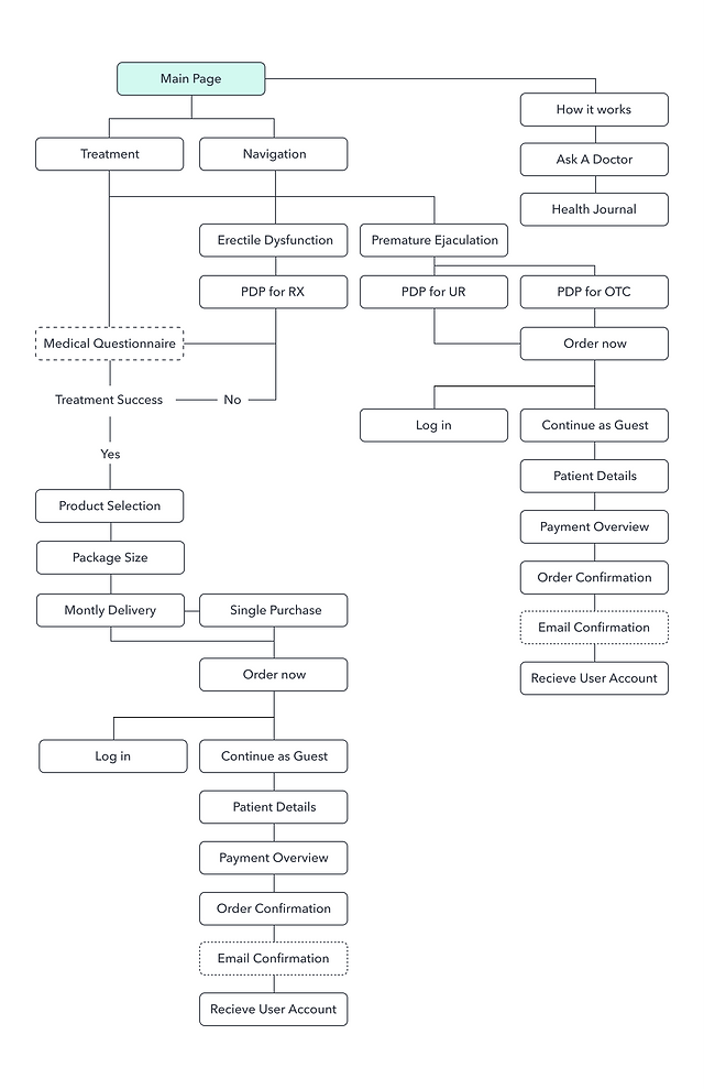
Conceptulisation
I started creating the information architecture and low-fi concepts for primary use cases. After having a go-ahead from the Product Manager, developers, and Stakeholders on the mockups, I began to conduct usability tests with the low-fidelity mockups. Once we had confidence in the design, we began digitalizing designs.


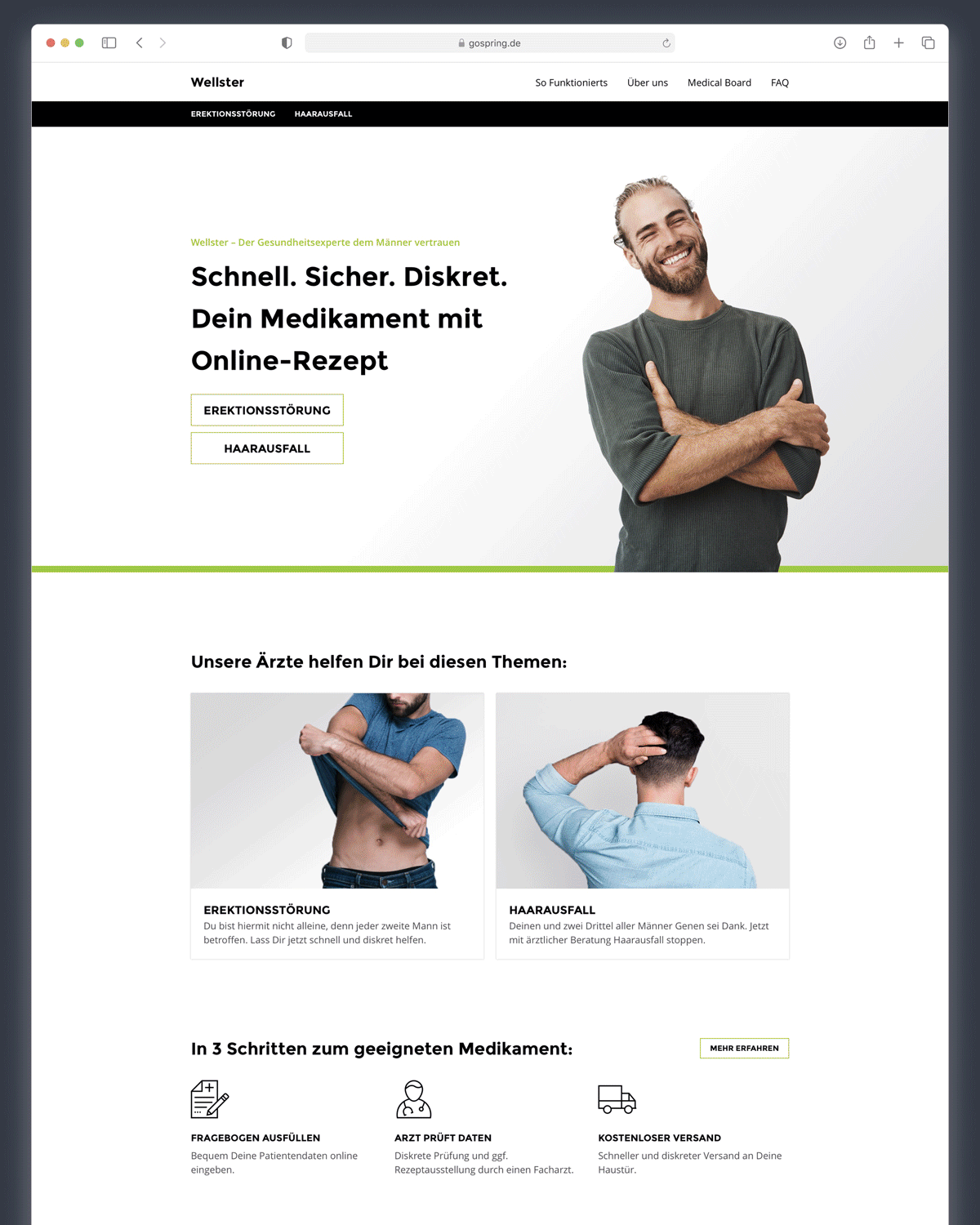
Inticing Home Page
A strong home page helps capture the audience and reassure them that we are their solution. I implemented a captivating visual and our list of top products, to help users to visualise their solution.

Organised Navigation
To enable an easy flow, a structured overview in the navigation helps guide the user into finding his solution as efficiently as possible.

Structured Product Detail Page
Simplicity is brought through an organised structure with a clear communication and a range of visuals to ease the user experience.

Guided Product Overview
As we offer a wide range of products for erectile dysfunction, a clear overview was needed to be able to compare the tablets, dosages, and prices in one overview.

Transparent Product Selection
During the product selection, users must select the delivery and number of tablets desired. Having a breakdown of the price and a full overview enables a more trustworthy and transparent shopping experience.
Performance
Through the re-design and continuous A/B testing, I helped GoSpring decrease the overall bounce rate to 26.38%, increased the conversion rate by 1.8%, and increased retention and engagement, we have been able to save 60% of clients that we’ve identified as “at-risk” of churning.